flowchart LR
A{Data type} -->|Continuous| B{Purpose}
A{Data type} -->|Discrete| C{Purpose}
B{Purpose}-->|Exploration| D((Histogram/Boxpot))
B{Purpose} -->|Association| E((Scatter plot))
B{Purpose} -->|Association+time| T((Line plot))
C{Purpose}-->|Exploration| F((Bar chart))
C{Purpose} -->|Association| G((Tree map))
Introduction to ggplot2
Introduction to ggplot2
![]()
In this chapter, we introduce ggplot2, a powerful plotting library in R for creating elegant and complex visualizations. We will guide you through the basics of ggplot2, including its grammar of graphics approach, and demonstrate how to create various types of plots.
What is ggplot2?
ggplot2 is part of the tidyverse collection of R packages, developed by Hadley Wickham (Wickham 2010). He received the COPSS Presidents’ Award for his contributions to the tidyverse collection. It is based on the grammar of graphics (Wilkinson 2011). As part of the tidyverse, it shares a framework that allows users to build plots layer by layer. This approach makes it highly flexible and intuitive once you understand its core concepts.
Basic Concepts of the Grammar of Graphics
Discussion
Based on the data we collected in the first lecture:
- What kind of message can be expressed through visualization?
- What kind of graph will you use?
- Why will you choose this graph to express such an idea?
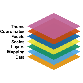
The concept of the grammar of graphics was first proposed by Wilkinson (Wilkinson 2011) (I cite the second edition, but it was initially described in the first edition in 2005). It outlines the seven basic elements of a statistical graph:
- Data:
- The information to visualize.
- Mapping:
- How data variables connect to aesthetic attributes.
- Displayed as x, y, color, shape, etc.
- Layer:
- Combines geometric elements (geoms: points, lines, polygons) and statistical transformations (stats: e.g., binning for histograms, fitting models).
- Represents what is visually displayed in the plot.
- Scales:
- Map data values to aesthetic values (e.g., color, size).
- Generate legends and axes for reading original data values.
- Coordinate System (Coord):
- Defines how data is mapped to the plot plane.
- Provides axes and gridlines (e.g., Cartesian, polar, map projections).
- Facet:
- Breaks data into subsets for small multiple plots (also called conditioning or trellising).
- Theme:
- Adjusts visual elements like fonts and colors.
- Default settings in ggplot2 are carefully chosen, but customization may require references like Tufte (1990, 1997, 2001).
Although this approach identifies individual elements of a statistical graph, it has faced several critiques:
- Which graph should I use?
- This framework does not work well in a programming language context, and later, Wickham (Wickham 2010) implicitly modified these layers.
- It does not account for interactive graphs.
Choosing the Visualization
Deciding which plot to use can sometimes be ambiguous for the user. The following questions and decision flowchart will help you determine which type of graph to use (at least within the scope of this course):
- What is the purpose of displaying the graph?
- What types of data are you going to present?
Getting Started
To use ggplot2, you first need to install and load the package in R:
Basic Plot Example
Before we start, let’s take a look at the data we are going to use:
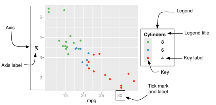
Data and mapping layer
Let’s create a simple scatter plot using the mtcars dataset, which is built into R:
From the code, you can see that data and mapping are encoded in the first line of the ggplot function:
\[ \text{ggplot}(\text{data=}\underbrace{\text{mtcars2}}_{\text{data}}, \text{mapping=}\underbrace{\text{aes(x = mpg, y = cyl, colour=am)}}_{\text{mapping}}) \]
Occasionally (and quite frequently), you will see people omit everything on the left-hand side (LHS) of the equal sign for data, mapping, x, and y, as these are standard arguments in ggplot2.
There are also other mapping options besides color:
- Size
- Line
- linetype
- lineend
- linejoin
- Dot
- Shape
Layers
These functions are named in the format geom_XXXX:
| Function name | |
|---|---|
| Histogram | geom_histogram() |
| Box chart | geom_boxplot() |
| Bar chart | geom_bar() |
| Scatter chart | geom_point() |
| Line chart | geom_line() |
One variable
Two variables
Scales
Scales are functions (or processes) that transform data for the graph. This process is often automatic, based on the type of layer and data, so users typically only need to modify the axis or legend display. These functions are named in the format scale_(AES)_(datatype):
| Discrete | Continuous | |
|---|---|---|
| X | scale_x_discrete() |
scale_x_continuous() |
| Y | scale_y_discrete() |
scale_y_continuous() |
| color | scale_color_discrete() |
scale_color_discrete() |
The argument and its corresponding components are listed in the below table and figure.
| Argument name | Axis | Legend |
|---|---|---|
| name | Label | Title |
| breaks | Ticks | Key |
| labels | Tick label | Key Label |
Coordinates and facet
Coordinates refer to the coordinate system of the graph and can help you adjust your plot. For most data we encounter, you sometimes need to adjust the range of the x and y axes. This can be done using the arguments xlim=c(LOWER_BOUND, UPPER_BOUND) for the x-axis and ylim=c(LOWER_BOUND, UPPER_BOUND) for the y-axis.
Facets allow you to break data into several subgraphs, separated by different subgroups. You can specify this with the notation: 1. For a one-factor scenario, use ~ FACTOR_A, which generates subplots for each level of FACTOR_A. (You can additionally specify nrow=x or ncol=x to arrange them over rows or columns.) 2. For a two-factor scenario, use FACTOR_A ~ FACTOR_B, which spreads FACTOR_B over rows and FACTOR_A over columns.
From time to time, you might want each subplot to share (or not share) the same scale (axis). You can specify this through the argument scales=XXX in the facet_wrap() function. The options for scales are listed below:
| free x axis | fixed x axis | |
|---|---|---|
| free y axis | free |
free_y |
| fixed y axis | free_x |
fixed |
Theme
There are several available options for the theme of your plot. Additionally, third-party packages like ggtheme offer different themes for plots.
Reading R documentation
It is by no means possible to cover all functions and attributes in this library, even though ggplot2 is relatively stable. The key to thriving in the coding world is to understand the mechanisms and concepts behind the code. For the rest, you can refer to the official documentation from the library authors:
Wrap-up
As a wrap-up, your code typically follows this structure:
\[ \small \begin{aligned} \text{ggplot()}+ &\\ \underbrace{\text{geom\_XXXX(data=DATA,mapping=aes(x,y,color,...))}}_{\text{plotting data}} + &\\ \underbrace{\text{scale\_AES\_TYPE(name="TITLE",breaks="TICK LOC",labels="TICK LAB")}}_{\text{Handeling axis, legend etc}} + & \\ \underbrace{ \text{coord\_cartesian(xlim=c(min,MAX), ylim=c(min,MAX))}}_{\text{Adjust coordinate systems}} + &\\ \underbrace{\text{ggtitle("CHART TITLE")}}_{\text{Plotting title}} \end{aligned} \]
About making graph
From the code introduced, it will be great to reflect on
- How does the code construction differ from your human process of plotting code?
- How does the 7 layer graphic language differ from the ggplot syntax?
- If you could make
ggploteasier to use, how would you design it?
Final remarks and acknowledgement
Save the plots
Add the function ggsave("FILE_PATH+FILE_NAME.png") after your ggplot instructions:
R generic visualization
R also provides generic functions for plotting data:
These functions have limited customization options (although you can still edit the figure and axis labels), so they are less commonly used in scientific publications.
The materials and content are largely adapted from Wickham (2016a). You can access the latest edition on the book website, which also covers more advanced topics. For detailed information on how to use the code and each function, refer to the ggplot2 library documentation via ??ggplot2.
Bibilography
Wickham, Hadley. 2010. “A Layered Grammar of Graphics.” Journal of Computational and Graphical Statistics 19 (1): 3–28.
———. 2016a. “Getting Started with Ggplot2.” In Ggplot2: Elegant Graphics for Data Analysis, 11–31. Springer.
———. 2016b. Ggplot2: Elegant Graphics for Data Analysis. Springer-Verlag New York. https://ggplot2.tidyverse.org.
Wilkinson, Leland. 2011. “The Grammar of Graphics.” In Handbook of Computational Statistics: Concepts and Methods, 375–414. Springer.