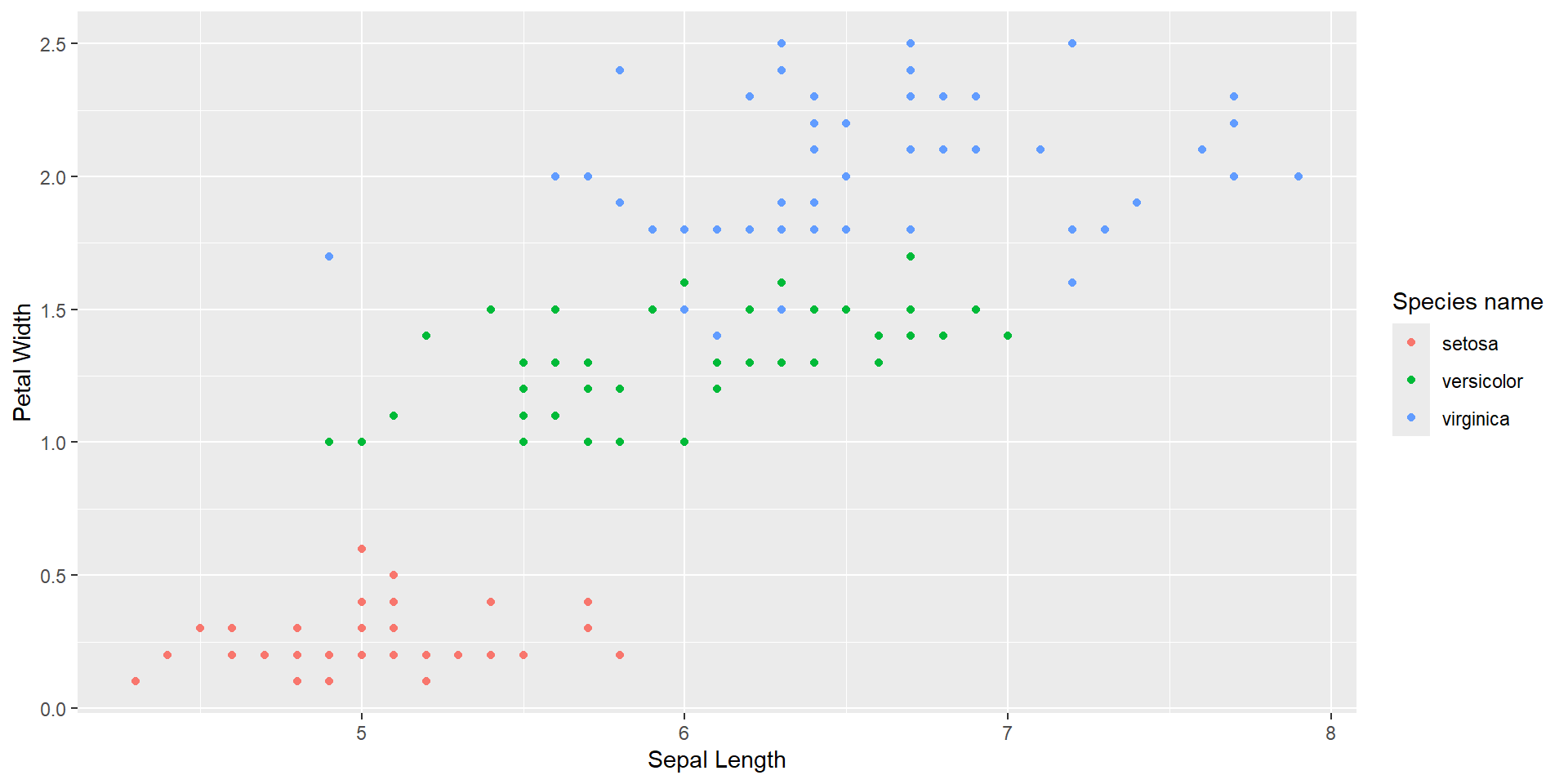
Introduction to R
Data visualization in ggplot2
Package
- A package is a bundle of functions, data, and documentation. You can import them through
- while using functions under the package you can use
or
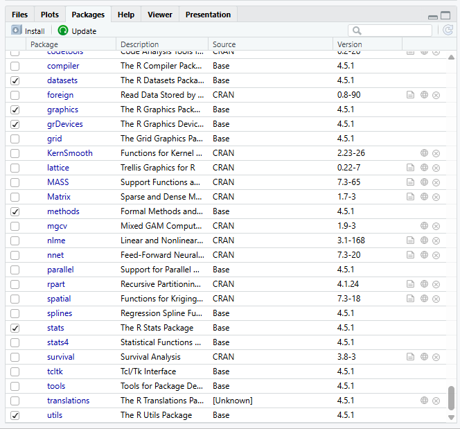
- You can check what packages have been installed, imported to your environment using the tab
Packages
ggplot2 example
- What are the elements in a graph ?
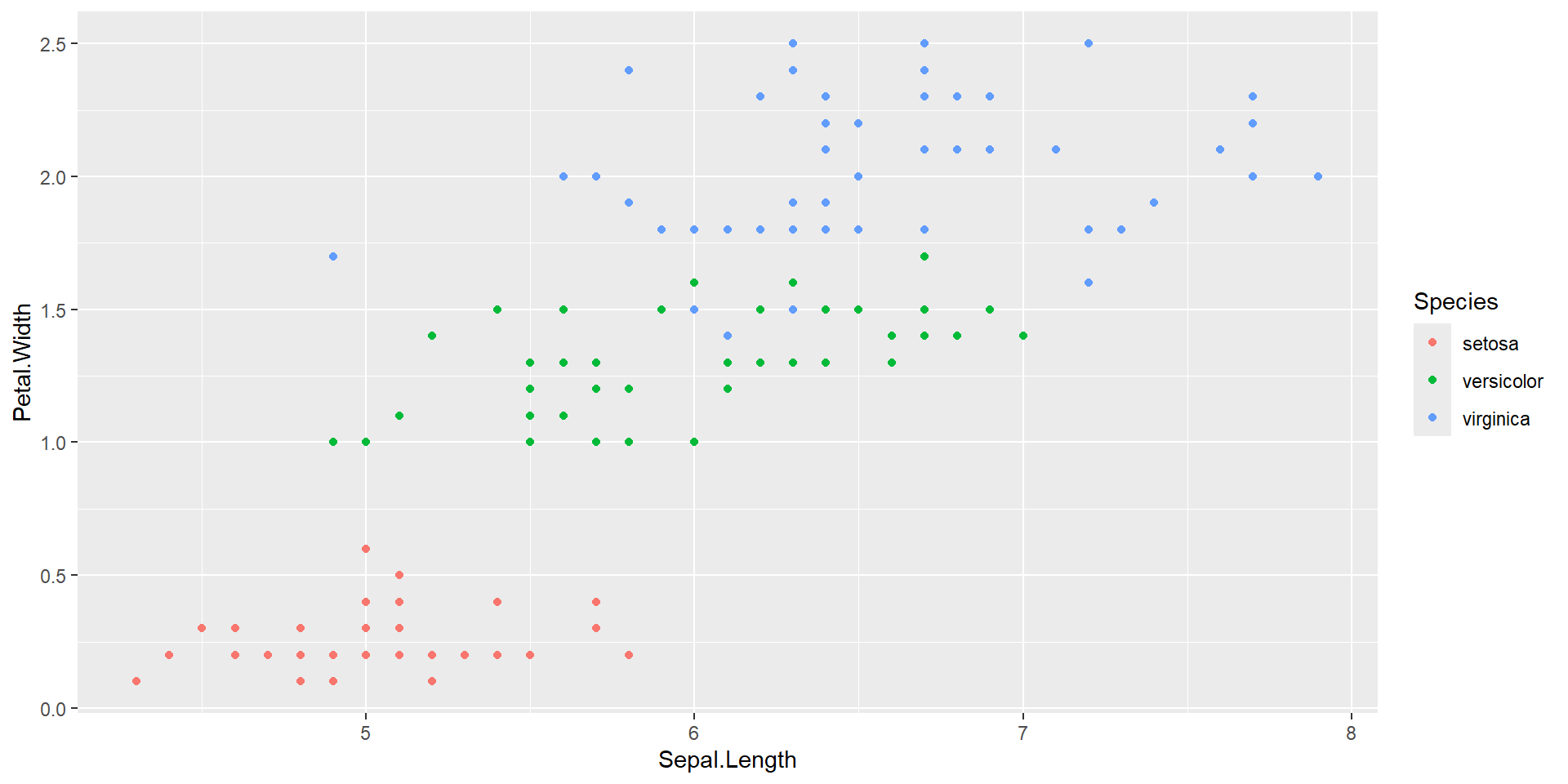
Components in the graph
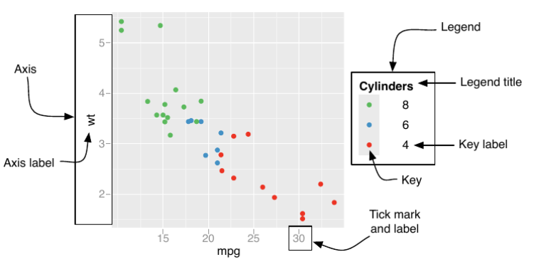
Overview of ggplot2 logics
ggplot2 is designed as if you are plotting by hand, so the process looks like
- Defining coordinate systems
- Plotting dots, lines, bars, and etc.
- Adding legend and axis information
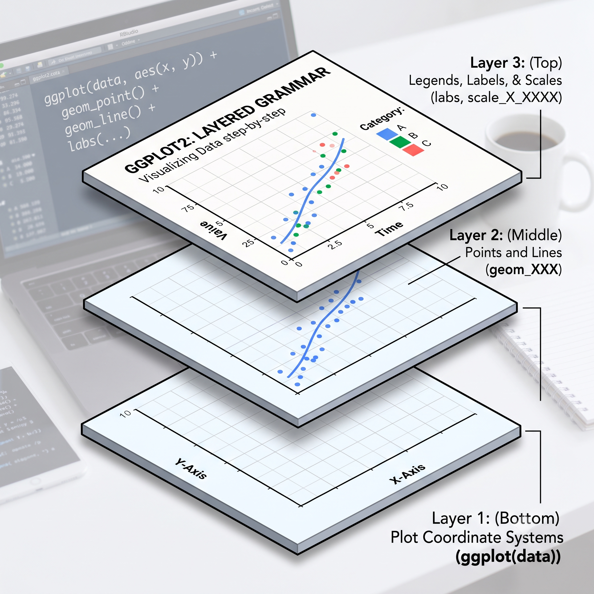
Layer 1: Coordinate system
First, we define the coordinate system for our gm data in R
The function is ggplot(), which takes two arguments 1
data: The data you are going to usemapping: Should be wrapped inaes()specifying how each column maps to the coordinate.
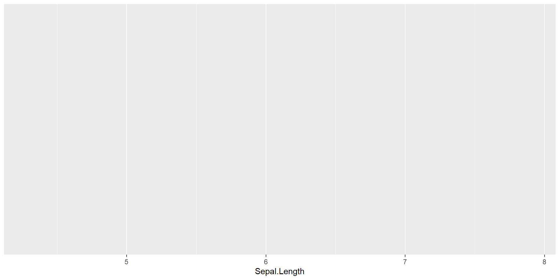
Layer 2: Example
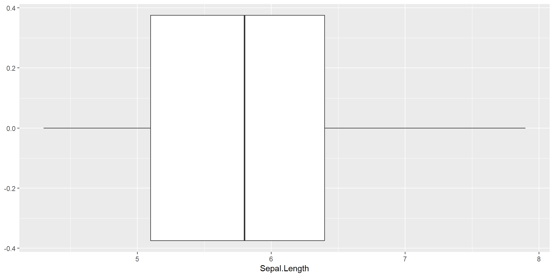
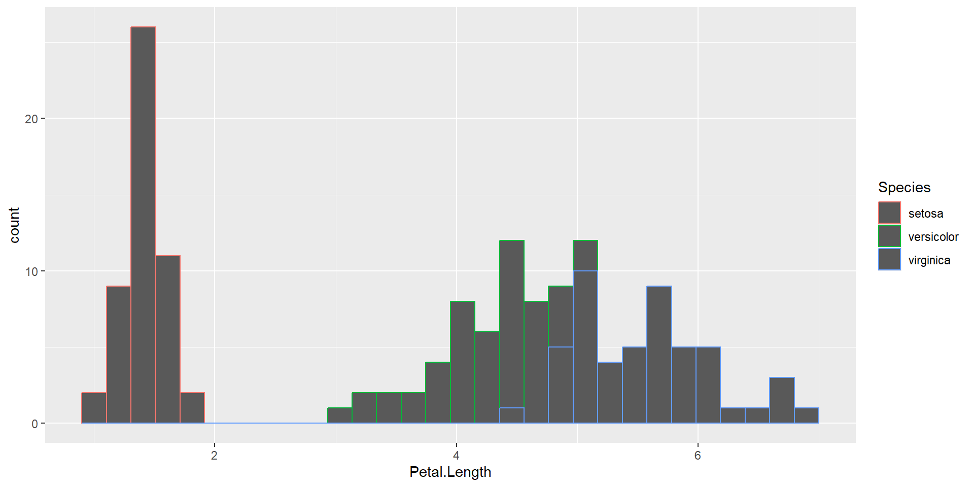
+operator to stack on the originalggplot()- Adding additional mapping in the
geom_XXX() - Overwriting mapping in the
ggplot()
More examples
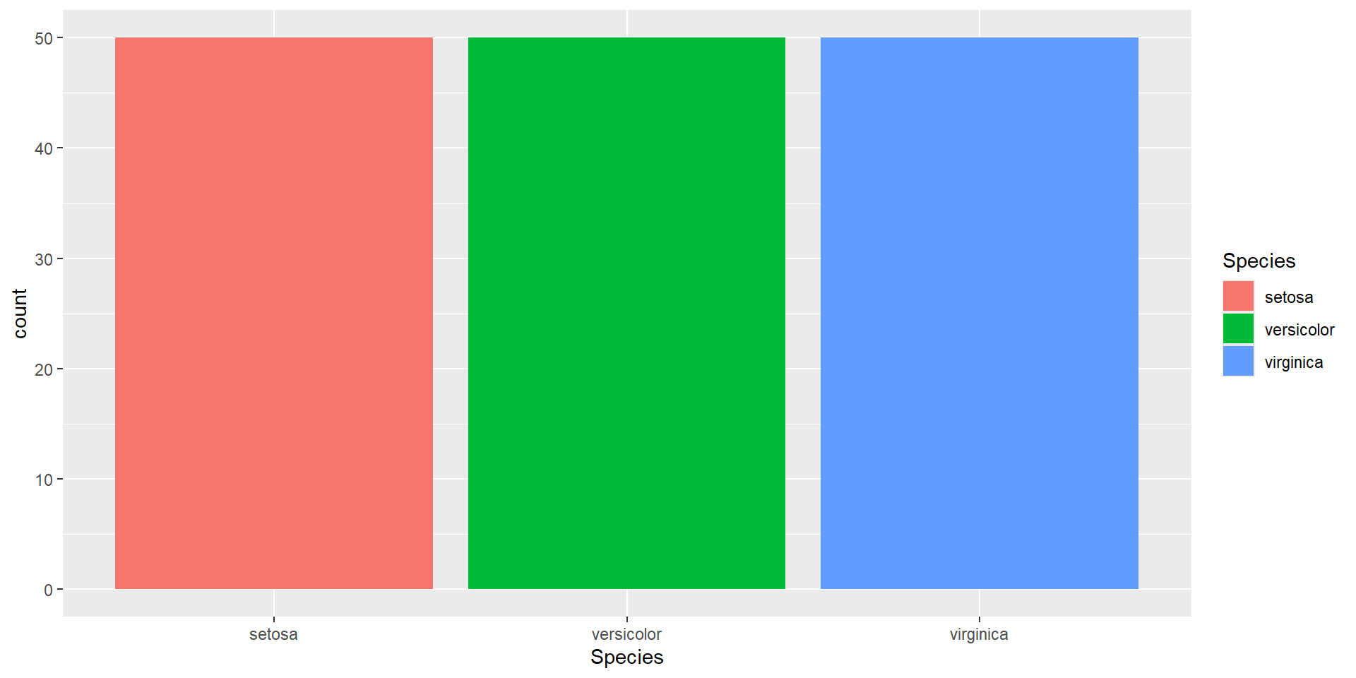
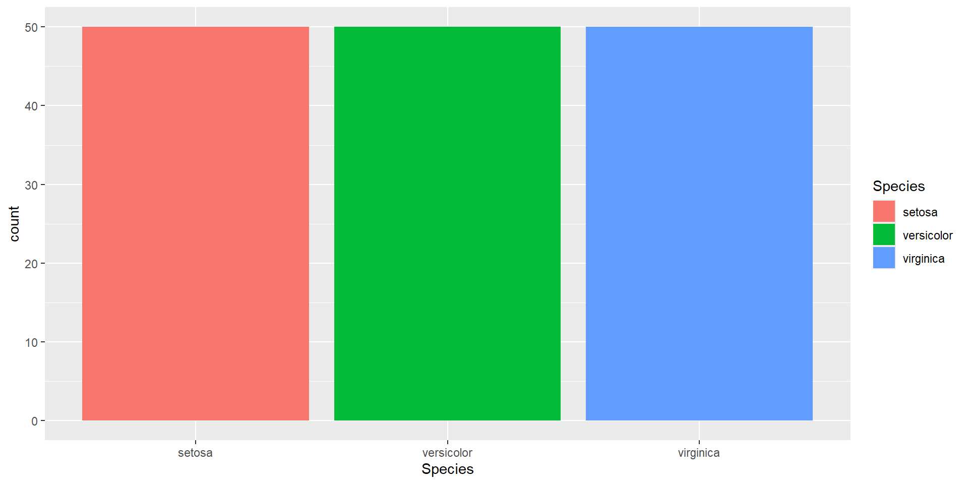
Some notes 1: color affects the border color (dots/lines), fill affects the rectangle color
Layer 3: Legends and axis
Scales are functions indicate how each variable behave and presents on the graph. The function usually in the format scale_(AES)_(datatype):
| Discrete | Continuous | |
|---|---|---|
| X | scale_x_discrete() |
scale_x_continuous() |
| Y | scale_y_discrete() |
scale_y_continuous() |
| color | scale_color_discrete() |
scale_color_continuous() |
| Argument name | Axis | Legend |
|---|---|---|
| name | Label | Title |
| breaks | Ticks | Key |
| labels | Tick label | Key Label |
Example
# Create a scatter plot with customized axis and color legend labels
   p +
  geom_point(aes(y = lifeExp, color=continent)) +  # Add points layer for data representation
  scale_x_continuous(name="GDP per capita") +  # Customize x-axis label
  scale_y_continuous(name="Life Expectancy",breaks=c(25,50,75)) + # Customize y-axis label
  scale_colour_discrete(name="Continent",labels=c("Afr", "Ameri", "Asia", "Eur", "Ocean"))  # Customize color legend title