Source: Blackmore et al. (2017), The effect of upper-respiratory infection on transcriptomic changes in the CNS.
Goal: Determine the effect of an upper-respiratory infection on changes in RNA transcription occuring in the cerebellum and spinal cord post infection
Experiment sample: Gender matched eight week old C57BL/6 mice
Exposure: With or without Influenza A infection
Observations: RNA-seq count of genes in the cerebellum and spinal cord tissues
Observation time: days 0 (non-infected), 4 and 8.
Task - Read two dataframe
Please read the data to your RStudio for further analysis
# Title: Read files and inspect data# Read the count matrix and metadata, then preview the first few rows.# --- Your code starts here ---# rnaseq <- read.csv("WRITE DOWN YOUR PATH HERE")# meta <- read.csv("WRITE DOWN YOUR PATH HERE")# --- Your code ends here ---# Show the first 3 rows and first 6 sample columns of the expression data.head(rnaseq[, 1:6], 3)
What are the pros and cons using absolute path and relative path ?
What will be the best practce to put the data file ?
Transforming data with dplyr
dplyr is a package for making tabular data manipulation easier. You can choose using
# Title: Load dplyr package# dplyr provides functions for easy data frame manipulation.library(dplyr)
or
using tidyverse an “umbrella-package” that installs several packages useful for data analysis which work together well such as tidyr, dplyr, ggplot2, tibble, etc.
# Title: Load tidyverse packages# tidyverse loads multiple data science packages like ggplot2, dplyr, and tidyr.library(tidyverse)
Pipeline mindset
Without dplyr, if we want to manipulate data, we can still using 0the following vanila way to perform the task :
# Title: Base R data manipulation example# Show how row selection, counting, and column updates work without dplyr.# Select rows 2 to 5 from the metadata.meta <- meta[2:5,]# Count how many female and male mice are in the selected rows.sum(meta$sex =='Female')sum(meta$sex =='Male')# Overwrite the sex column with a logical value indicating male samples.meta$sex = meta$sex =='Male'
Discussion question
What are the common features for these operations
What are the pitfalls in using this approach ?
Pipe operator %>%
To prevent us from keep doing like a matryoshka doll
# Title: Nested function call example# This shows the same work as a pipeline, but in nested form.h(g(f(data_frame)))
Libraries under tidyverse support Pipe operator %>%
We can rewrite the above code as
# Title: Pipe operator example# Use the pipe operator to write the same steps in a clearer, left-to-right order.data_frame %>%f() %>%g() %>%h()
%>% takes the output from the left hand side and then pipes it to be the first argument of the right function.
Discussion question
What are the benefits of using pipe?
Select columns or rows
Select the designated columns by select(COLUMN_NAMES)
# Title: Select metadata columnsmeta %>%select(age, sex, infection) %>%# Keep only the age, sex, and infection columns.head(3) # This line is for display control, you can omit it and the previous %>%.
age sex infection
1 8 Female InfluenzaA
2 8 Female NonInfected
3 8 Female NonInfected
Select the designated rows by filter(CONDITION)
# Title: Filter rows by sexmeta %>%filter(sex =='Female') %>%# Keep only female samples.head(3) # This line is for display control, you can omit it and the previous %>%.
# Title: Create or modify columnsmeta %>%mutate( # Use mutate() to update the time column and add a new infection flag.time = time + age,infection ="No" ) %>%head(3)
sample organism age sex infection strain time tissue mouse
1 GSM2545336 Mus musculus 8 Female No C57BL/6 16 Cerebellum 14
2 GSM2545337 Mus musculus 8 Female No C57BL/6 8 Cerebellum 9
3 GSM2545338 Mus musculus 8 Female No C57BL/6 8 Cerebellum 10
Perform summary statistics
Frequently we will need to provide summary statistics for your data, we can use summarize() to do it
# Title: Compute summary statisticsmeta %>%summarize( # Summarize the metadata with count, mean, standard deviation, and female sample count.n=n(),mean_time=mean(time),sd_time=sd(time),num_female=sum(sex=='Female') )
n mean_time sd_time num_female
1 22 4 3.265986 12
Some common summary function could be
mean()
sd()
max(), min()
sum()
n()
Summary statistics by group
group_by() and summarizep rovide summary statistics by group.
You can group by multiple groups together, but noted that they need to be stated in the same group_by() brackets
# Title: Grouped summary by infectionmeta %>%group_by(infection) %>%# Group the metadata by infection status,summarize( # and compute summary statistics for each group.n=n(),mean_time=mean(time), )
# A tibble: 2 × 3
infection n mean_time
<chr> <int> <dbl>
1 InfluenzaA 15 5.87
2 NonInfected 7 0
# Title: Multi-group summarymeta %>%group_by(infection, sex) %>%# Group by both infection status and sex,summarize( # then summarize the combined groups.n=n(),mean_time=mean(time),sd_time=sd(time), )
Condition modification
Using if_else(CONDITION, TRUE, FALSE) or case_when(CONDITION ~ OUTCOME, ...) to rematch condition into certain value/ ordinal items
if_else is only for dichotomous processing
case_when can handle sequential logical control
# Title: Create binary infection status# Use if_else() to add a new infection_status column based on time value.meta %>%select(sample, age, sex, time) %>%mutate( infection_status =if_else( time ==0, "Not infected", "Infected" )) %>%head(3)
sample age sex time infection_status
1 GSM2545336 8 Female 8 Infected
2 GSM2545337 8 Female 0 Not infected
3 GSM2545338 8 Female 0 Not infected
# Title: Create categorical infection stage# Use case_when() to assign descriptive labels for each time point.meta %>%select(sample, age, sex, time) %>%mutate( infection_status =case_when( time ==0~"Not infected", time ==4~"Early stage", time ==8~"Late stage" ))%>%head(3)
sample age sex time infection_status
1 GSM2545336 8 Female 8 Late stage
2 GSM2545337 8 Female 0 Not infected
3 GSM2545338 8 Female 0 Not infected
Combining Dataframes
Consider we have data_frame sample_metadata.csv and count_matrix.csv. If we want to combine them together. We can use join()
There are four options
inner_join(x, y): Keeps rows present in both tables.
left_join(x, y): Keeps all rows from x, matching rows from y.
right_join(x, y): Keeps all rows from y, matching rows from x.
full_join(x, y): Keeps all rows from both tables.
Combining Dataframes
First I transpose the RNA count matrix. (The below code chunk is out of the scope, you might ignore why it works)
# Title: Transform RNA count matrix layout# Convert the RNA data from wide to long and back to wide format by gene.rnaseq <- rnaseq %>%pivot_longer(cols=-gene, names_to="sample", values_to ="value") %>%pivot_wider(names_from = gene, values_from = value)
You can combine meta data and rna sequence data together.
# Title: Join metadata with RNA data# Combine the sample metadata with the RNA expression table by sample ID.meta %>%left_join(rnaseq, by ='sample') %>%select(1:12) %>%head(3)
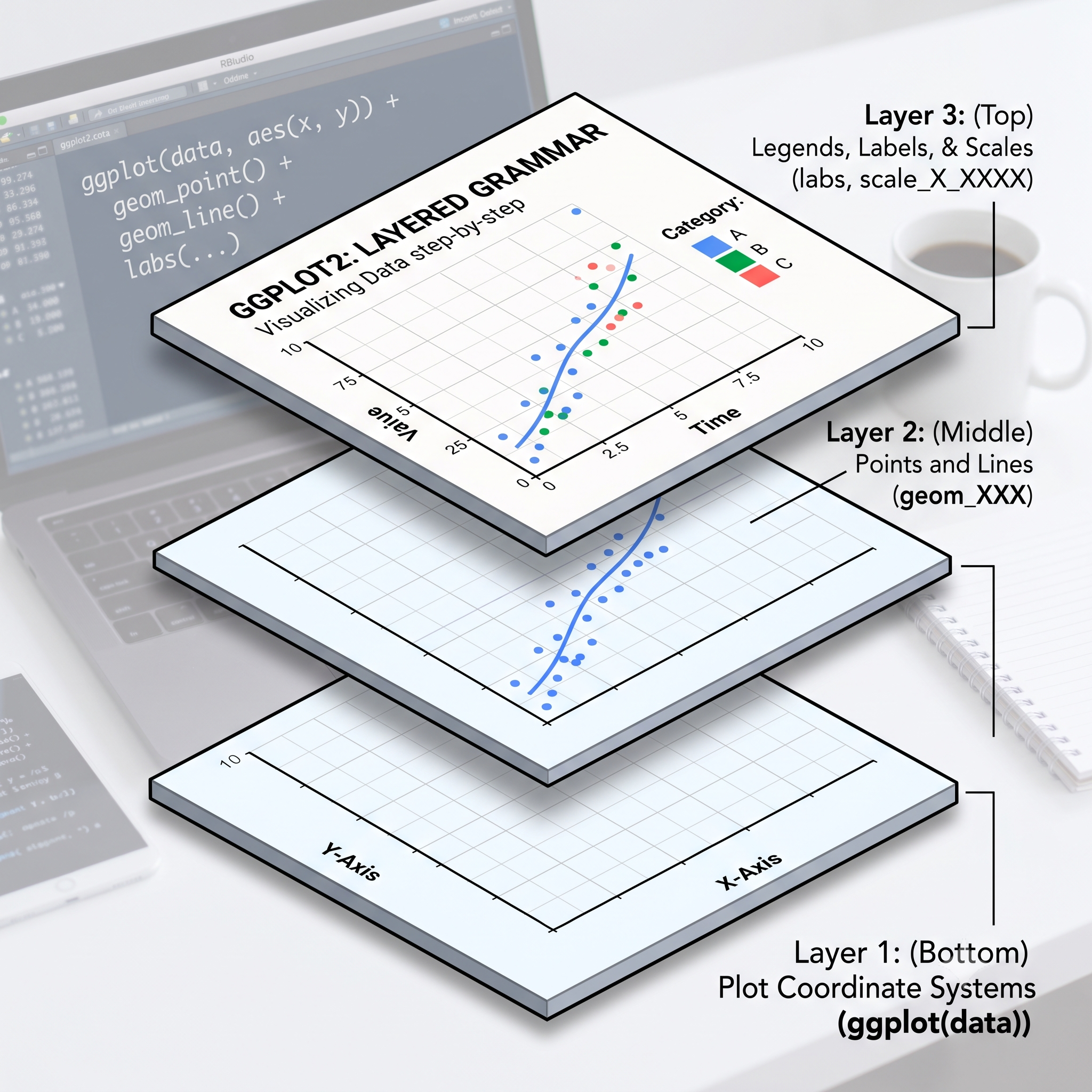
ggplot2 desgined as you are plotting by hands, so the process will looks like
Defining coordinate systems
Plotting dots, lines, bars, and etc.
Adding legend and axis informations
Layer features of ggplot2
Layer 1: Coordinate system
First, we define the coordinate system for our iris data in R
The function is ggplot(), which takes two arguments 1
data: The data you are going to use
mapping: Should be wrapped in aes() specifying how each column maps to the coordinate.
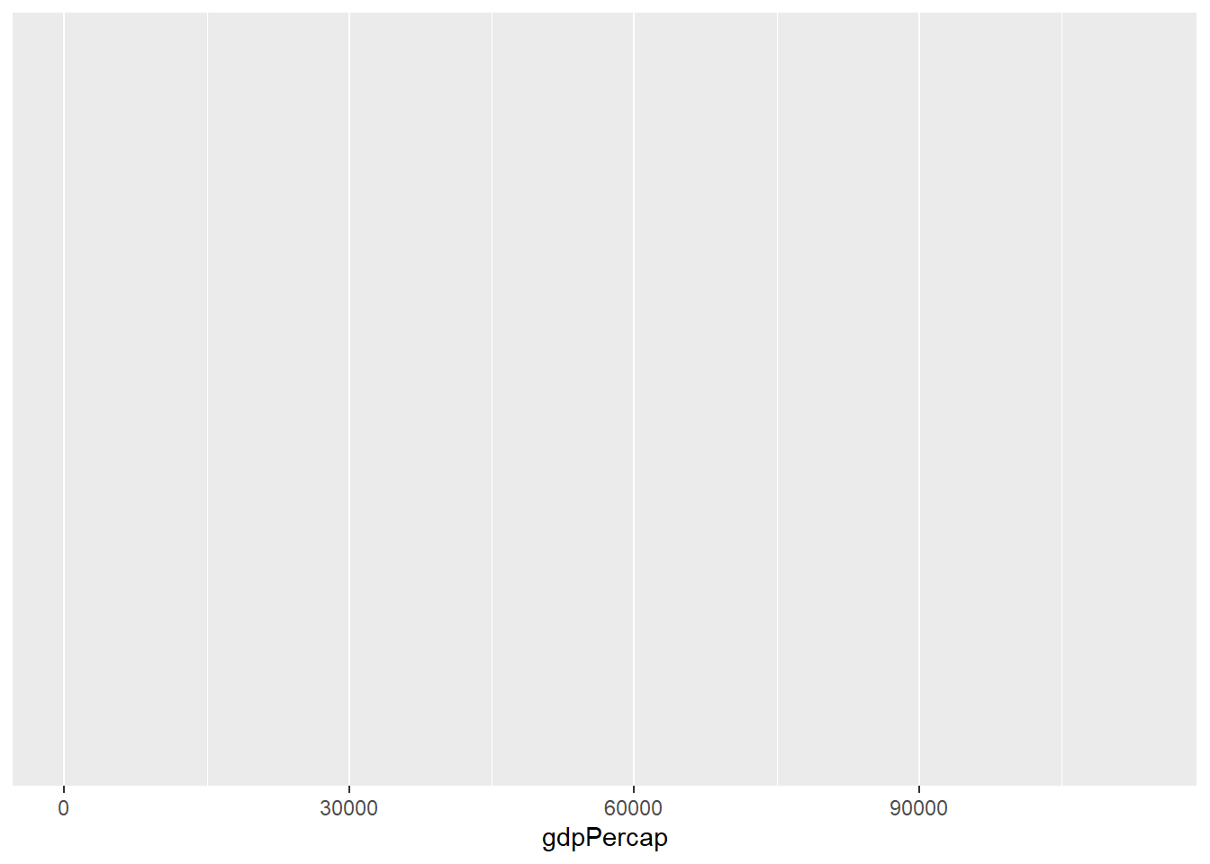
# Initialize a ggplot object with # data and aesthetic mappingsp <-ggplot(data=iris, mapping =aes(x = Sepal.Length))p # Display the base plot (no layers added yet)# Alternative # p <- ggplot(iris, aes(Sepal.Length))# p
Figure 1: Showing coordinate systems in ggplot2
Layer 2: Plotting data
The general format for plotting items will be
geom_XXX(mapping=aes())
In aes(), you can map anything to the figure, common terms could be
x
y
color, or colour
fill, shape, etc.
These functions are named in the format geom_XXXX:
Some notes1: color affects the border color (dots/lines), fill affects the rectangle color
Layer 3: Legends and axis
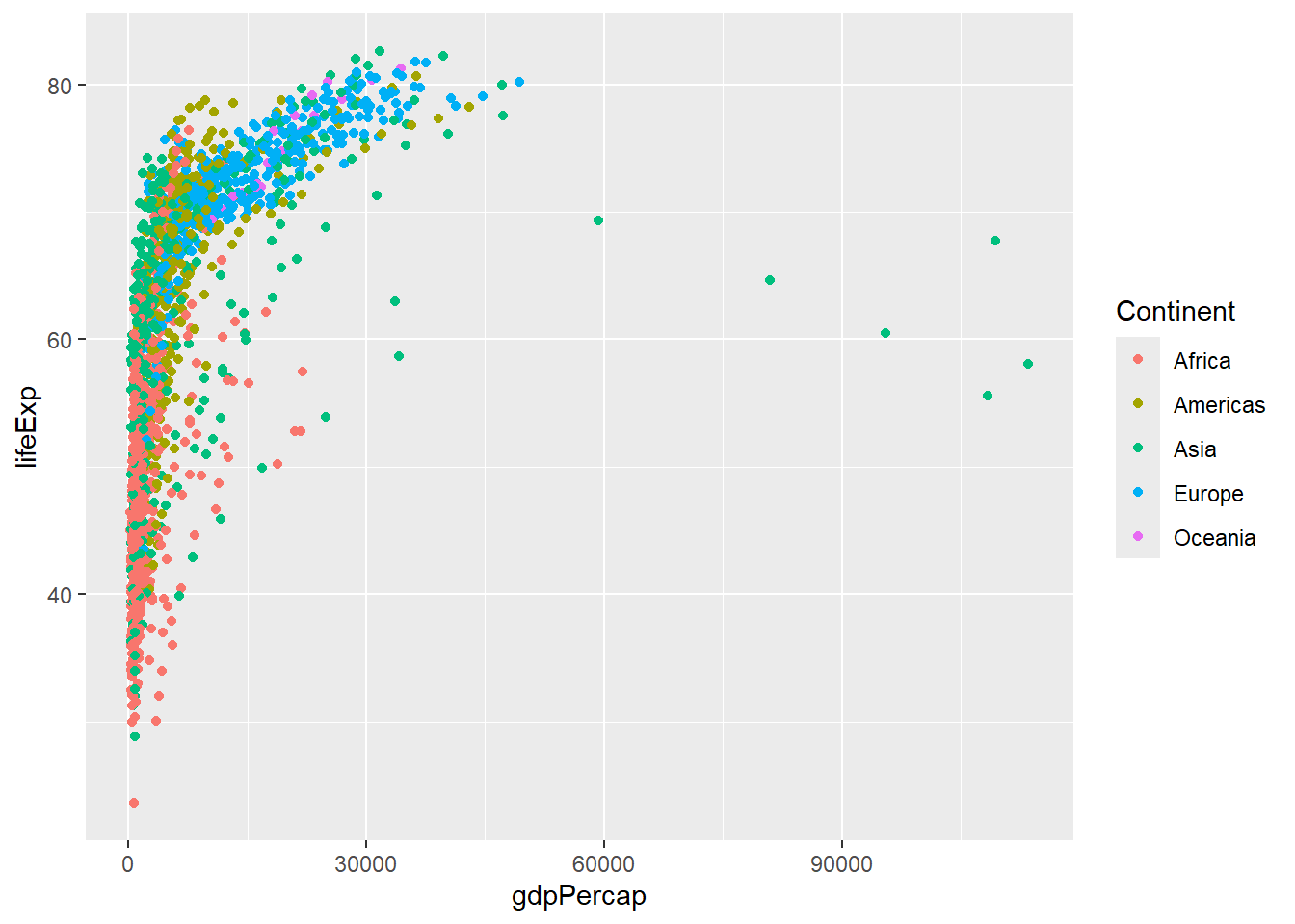
Scales are functions indicate how each variable behave and presents on the graph. The function usually in the format scale_(AES)_(datatype):
Discrete
Continuous
X
scale_x_discrete()
scale_x_continuous()
Y
scale_y_discrete()
scale_y_continuous()
color
scale_color_discrete()
scale_color_continuous()
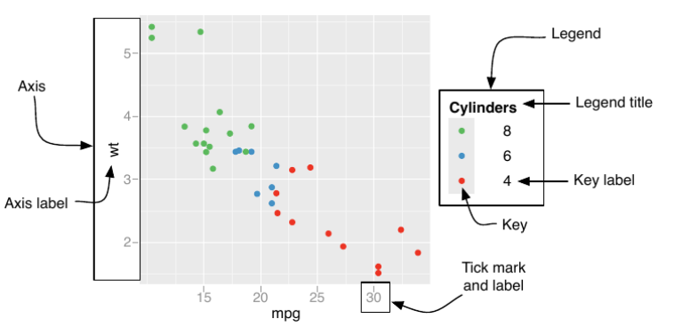
Most of time you only need to handle the presentation in
Argument name
Axis
Legend
name
Label
Title
breaks
Ticks
Key
labels
Tick label
Key Label
Example
# Create a scatter plot with customized axis and color legend labels p +geom_point(aes(y = Petal.Width, color=Species)) +# Add points layer for data representationscale_x_continuous(name="Sepal Length") +# Customize x-axis labelscale_y_continuous(name="Petal Width") +# Customize y-axis labelscale_colour_discrete(name="Species name") # Customize color legend title
Figure 2: Scatter plot of MPG vs cylinders with customized axis and legend labels.
Save figure
Add the function ggsave("FILE_PATH+FILE_NAME.png") after your ggplot instructions:
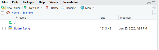
# Saving plots as figure_theme_grey.png at the folder figureggsave("figure_1.png",p)
It support most of the common image formats like pdf, jpeg, png
Saved figure location
Final notes
There are far more things you can do in ggplot2
Try to look up on the reference (or even use AI) when you need it.